



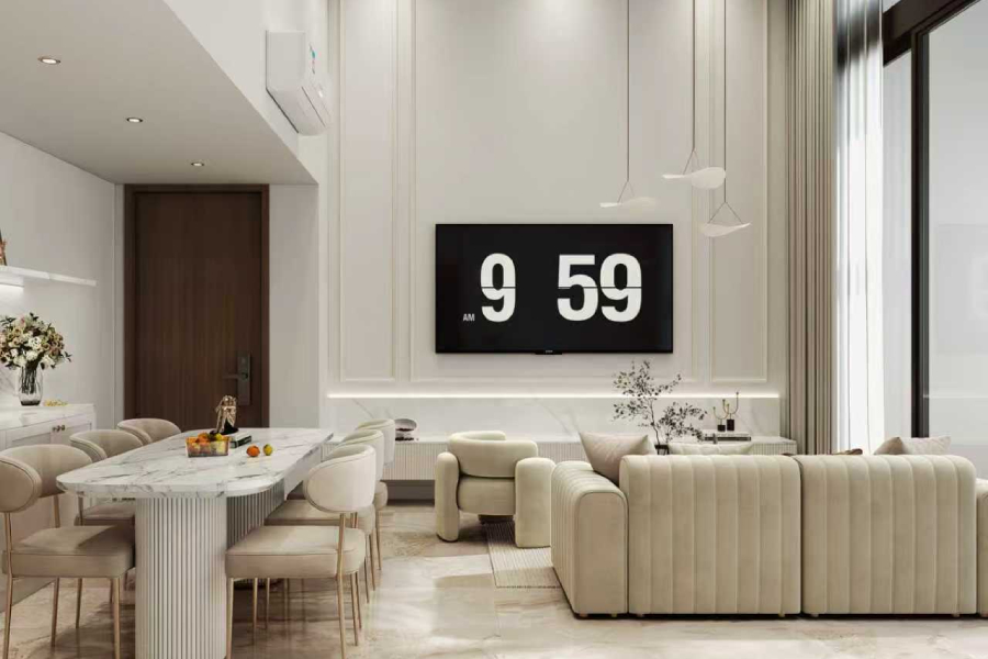
Hotel suites have a particular quality that many homeowners try to recreate and few manage to pull off. The rooms feel finished without feeling fussy, everything has a place, and the palette rarely strays beyond a handful of tones. This loft unit at Waterbay gets there by keeping the material list short and repeating it with discipline from the ground floor to the upper level.
Marble runs underfoot across the whole lower storey. Brass appears on chair legs, tap fittings, and cabinet knobs. Almost every soft surface sits somewhere between cream and warm greige. That consistency is what makes the home feel considered instead of decorated.
A Double-Height Living Room That Uses Its Ceiling
The main living area sits under a two-storey void, and the design treats that height as an asset. A tall panelled feature wall runs the full height behind the television, with fine mouldings picked out in a soft champagne tone that catch the light without shouting. The television sits at normal viewing height, with a low floating console below it lit by a concealed strip, which stops the wall from feeling top-heavy.
Two slim pendant lights drop from the ceiling on long cables, their leaf-shaped shades filling the middle of the void so the space between floor and ceiling reads as occupied.
The seating is a channelled cream modular sofa paired with a rounded bouclé armchair, and the dining table sits directly beside it. Placing the two zones side by side within one open plan, without a partition, keeps the sightline to the full-height glazing clear from almost anywhere in the room.
How the Palette Carries the Whole Home
Neutral schemes get a reputation for being safe, but they take real discipline to execute at this scale. The trick here is variation in texture instead of variation in colour. The floor is polished marble-look porcelain, the sofa is ribbed velvet, the armchair is bouclé, the dining chairs are smooth leather, and the table base is fluted stone. All of it sits within a narrow tonal band, so the eye reads richness instead of sameness.
Well-planned loft interior design also has to account for how sound and light behave in a double-volume space. Hard surfaces bounce noise around, which is why the curtains here run floor to ceiling and the rugs are generous. Making the most of a unit like this is really about maximising vertical square footage instead of simply admiring the height, and that means thinking about acoustics, storage, and how the upper level connects back down.
The Staircase and the Flow Behind It
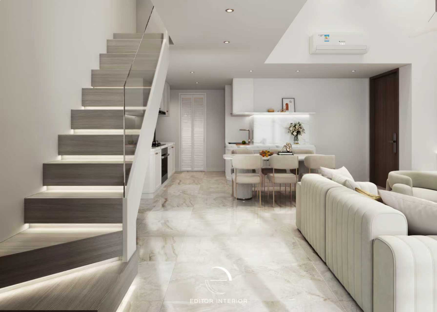
The staircase tucks against one side wall, with timber treads and a slim glass balustrade. Each riser carries a concealed light strip, which turns the flight into a soft feature at night and removes the need for a bright overhead fitting in the stairwell.
Beyond the stair, the corridor leads to the entrance door in a deeper walnut tone, one of very few dark elements in the home and a useful full stop at the end of the sightline.
A Kitchen That Speaks the Same Language
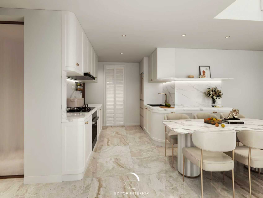
The kitchen sits in line with the dining area, finished in white shaker-style cabinetry with brass knobs. A marble-veined backsplash runs behind the hob and the sink run, lit from beneath the upper cabinets so the veining stays visible while cooking.
One detail here deserves attention: the cabinet corners have been curved instead of squared off. Rounded ends soften a galley layout considerably and are far more forgiving in a home where people walk past constantly. A louvred door conceals the utility area at the far end, keeping the working parts of the kitchen out of view from the sofa.
A Bedroom Built Around One Feature Wall
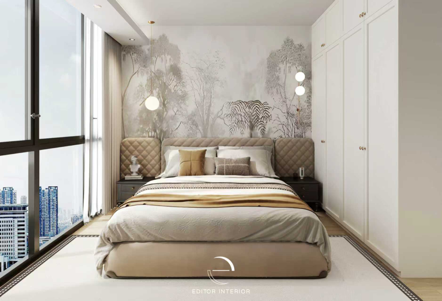
Upstairs, the main bedroom takes a gentler approach. A muted landscape mural covers the wall behind the bed, painted in washed greys and greens so it reads as texture rather than as a picture. Quilted upholstered panels flank the headboard, extending the soft surface across the width of the wall.
Dark timber bedside tables provide contrast against all that pale upholstery, and asymmetric lighting keeps the composition from feeling too formal. A single glass globe pendant hangs on one side while a slim double sconce sits on the other. Fitted wardrobes run along the opposite wall in the same shaker profile used downstairs.
A Window Nook That Earns Its Space
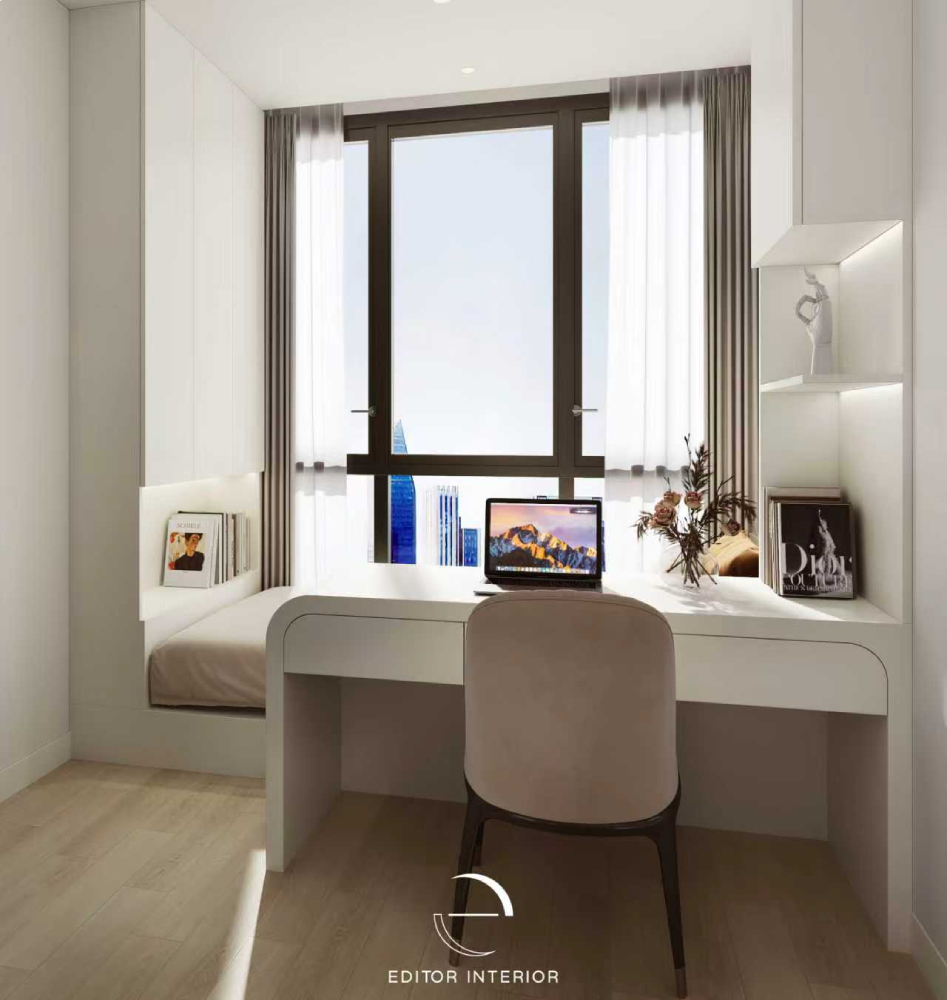
One of the smaller rooms shows how carefully the joinery has been planned. A built-in desk runs across the window, with a cushioned window seat continuing to one side and lit display shelving to the other. Everything is carpentered in, so a room that could easily have become a spare-bed dumping ground works as a study, a reading corner, and occasional guest space.
Bathrooms Kept Deliberately Simple
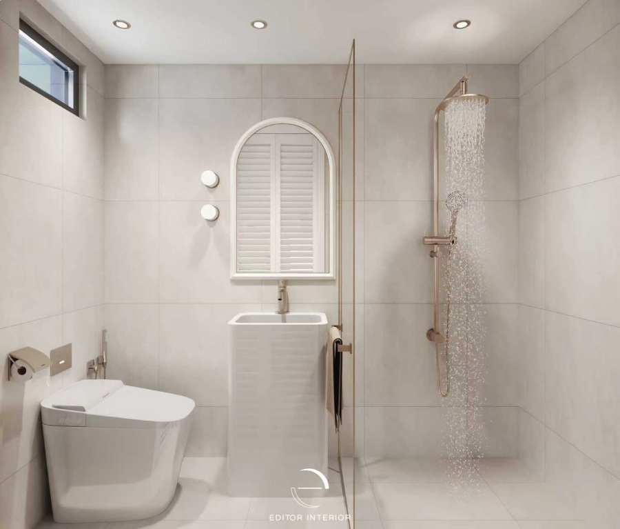
The bathrooms take the opposite approach to the bedrooms, which is the right call. Large-format tiles in a pale stone finish cover walls and floor with minimal grout lines, and a freestanding basin sits below a small arched louvred window. Brushed brass fittings tie back to the kitchen hardware, and the glass shower screen is frameless to keep the room reading as one continuous volume.
Planning a Home Like This?
This Waterbay project shows what a tight palette and consistent detailing can achieve in a double-volume home. Editor Interior works with homeowners across Singapore on lofts, condominiums, HDB flats, and landed properties, turning a set of requirements into spaces that stay liveable long after the styling comes out.
If you have a project in mind, get in touch with the team for a chat about what is possible.