



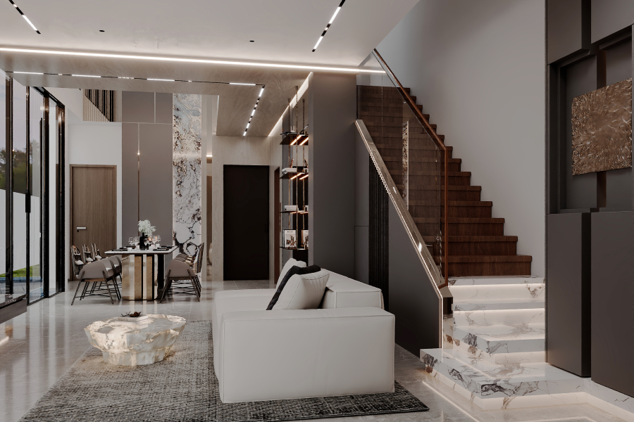
Walking into a home like this one on Tavistock Avenue, the first thing you notice is not any single feature. It is the sense that everything has been measured. Ceiling lines run clean from one end of the ground floor to the other. Stone, timber, and metal appear in careful amounts. Nothing shouts for attention, yet the whole place has a quiet confidence to it.
This is a large landed property, and large homes come with a particular risk. Without a clear plan, they end up as a series of disconnected rooms that never quite feel like one house. The design here avoids that by keeping the material language consistent and letting a few strong moments carry the drama.
A Ground Floor That Reads as One Continuous Space
The living area, dining zone, and stair core all sit within a single open plan, separated by changes in level and material instead of walls. A modular white sofa anchors the lounge, paired with a sculptural stone coffee table that looks carved from a single block. The rug beneath is a fine black-and-white weave, subtle enough to define the seating area without competing with anything around it.
Behind the sofa, the staircase makes its entrance. The lower treads are cut from book-matched marble and lit from below, so they appear to float. Above that, the flight switches to warm timber with a slim glass balustrade and a bronze handrail, with a light line running along its length. The material change from stone to wood happens exactly where the stair leaves the public zone, which is a small decision that does a lot of work.
Recessed track lighting runs across the ceiling in fine dotted lines, replacing the usual scatter of downlights with something far more graphic.
The Dining Area and Its Double-Height Moment
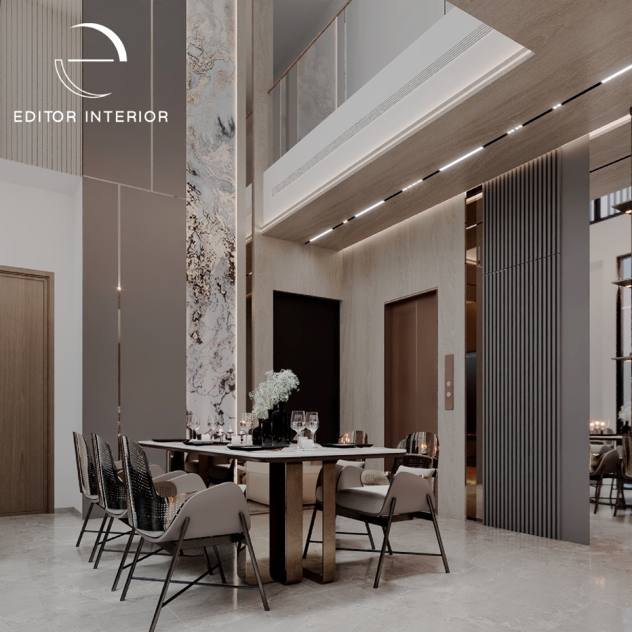
The dining area sits under a void that runs the full two storeys, and the designers have used that height properly. A slab of dramatically veined stone runs from floor to upper level, framed by concealed lighting on both edges so the pattern is legible even at night. The upper landing is visible from below, which keeps the two floors connected instead of stacked.
Choosing the right material for a run like this is a real decision rather than a finishing touch, and comparing sintered stone vs. natural marble is often the starting point for homeowners planning a high-span feature. Both perform well; the difference lies in veining, joins, and how the surface ages.
The table itself has a stone base and a pale top, surrounded by chairs with metallic mesh backs that catch the light. Beside the dining zone, a bronze-toned lift door sits flush within a timber-clad wall, so unobtrusive that you could easily miss it.
Why a Private Lift Suits This Kind of Home
Home lifts have become far more common in Singapore’s landed segment, and for practical reasons. A three or four storey house is a lot of stairs to climb several times a day, particularly for older family members or anyone carrying groceries up from the car porch.
Thoughtful landed property interior design treats the lift as part of the architecture instead of an afterthought bolted into a corner. Here, the shaft is wrapped in the same travertine-look finish as the surrounding wall, with the call panel set into a bronze plate. A fluted grey partition sits alongside it, screening the lift lobby from the dining table without closing it off.
Positioning the lift centrally also means it serves every floor from the same point, which keeps the upper-level circulation simple.
A Feature Wall That Frames the Television
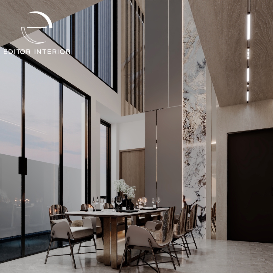
The television wall shows the same restraint at work. Rather than mounting the screen on bare plaster, the designers built a composition of timber panels, a marble insert, and a low stone ledge running the full width. Vertical light channels sit on either side, and a slim shelf niche to the left holds a few objects.
Full-height sliding glass opens directly to the pool deck, so the wall is read against daylight for most of the day. The marble insert sits directly behind the screen, meaning the pattern still registers when the television is switched off.
Upstairs: A Master Bedroom With a Stone Headboard Wall
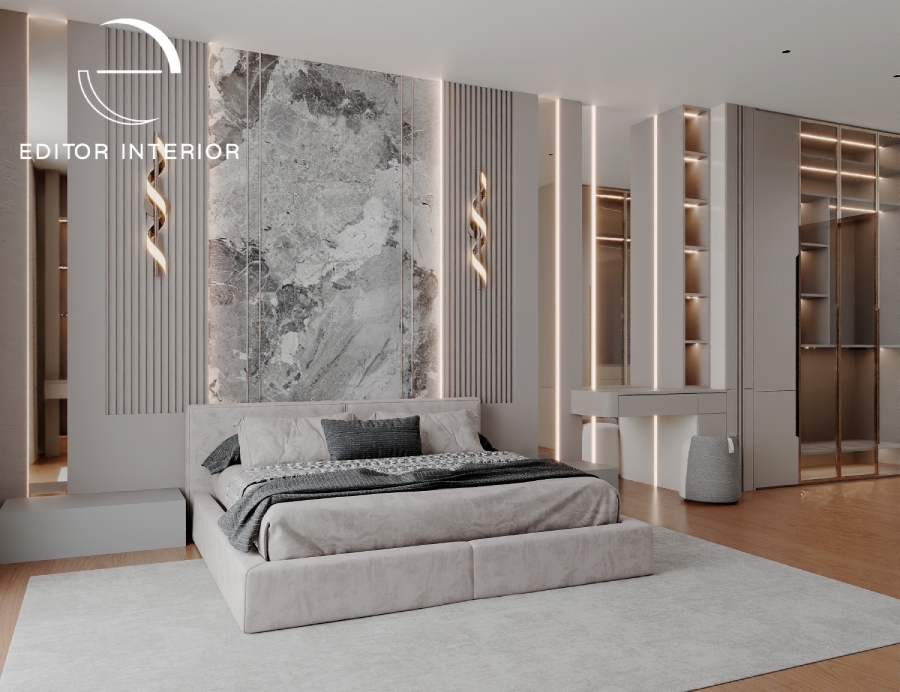
The master bedroom carries the ground floor palette upstairs but softens it considerably. A large marble panel sits behind the bed, flanked by fluted panelling in a warm greige and separated by fine metal reveals. Two sculptural sconces in a twisted ribbon form add a decorative note against the otherwise geometric backdrop.
To the right, the room opens into a fitted dressing zone with a slim vanity, lit display shelving, and glass-fronted wardrobes. Keeping the wardrobe within the bedroom footprint saves the corridor space a separate walk-in would demand.
A Guest Bedroom With Textured Stone
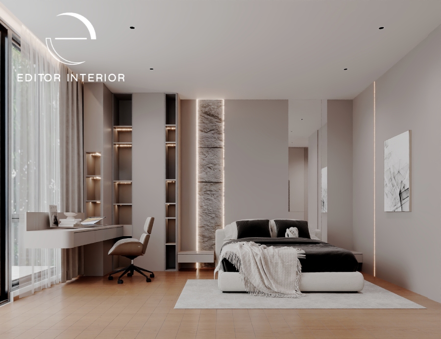
One of the secondary bedrooms takes a different approach. A column of rough-hewn stone runs floor to ceiling beside the bed, edged with concealed lighting that rakes across the surface and picks up every ridge. The contrast against the smooth plaster is what makes it work.
A floating desk sits by the window with lit shelving above, and the wardrobe joinery beside it uses recessed vertical grooves instead of handles. Warm timber flooring keeps the room from feeling clinical.
Ready to Plan Your Own Landed Home?
This Tavistock Avenue project shows what a consistent material story can do across a large house. Editor Interior works with homeowners across Singapore on landed properties, condominiums, and HDB flats, translating requirements into spaces that hold up over years of daily living.
If you are planning a renovation of your own, get in touch with the team to start the conversation.